Since the humble beginnings of our transport company, Josh and I have together taken on many roles. My business acumen and Josh’s operational skills and knowledge of the industry was certainly a recipe for success. Whereas Josh’s passion for trucking and the Kenworth brand ran deep, haulage and its equipment were foreign to me. As was branding.
Nevertheless, I have always been determined and have never shied away from new experiences. The great inventor Thomas Edison is quoted as saying “success is 10% inspiration and 90% perspiration” and Carter has displayed this attribute as the business has developed. I turned my attention to branding, or more specifically, a Carter Heavy Haulage & Transport logo.
It wasn’t a big decision. There was only a minimal budget available. With no branding experience, Josh supplied the brief, and it was as simple as the colour palette – a no brainer. Josh’s favourite colour is green, so we rolled with it. Josh has had a connection with Kenworth from his days as a tiny tot. He completed his apprenticeship at the local dealership Gilbert & Roach, Hexham, and now he owns and operates a fleet of Kenworth big rigs. “This is truly living the dream,” he says
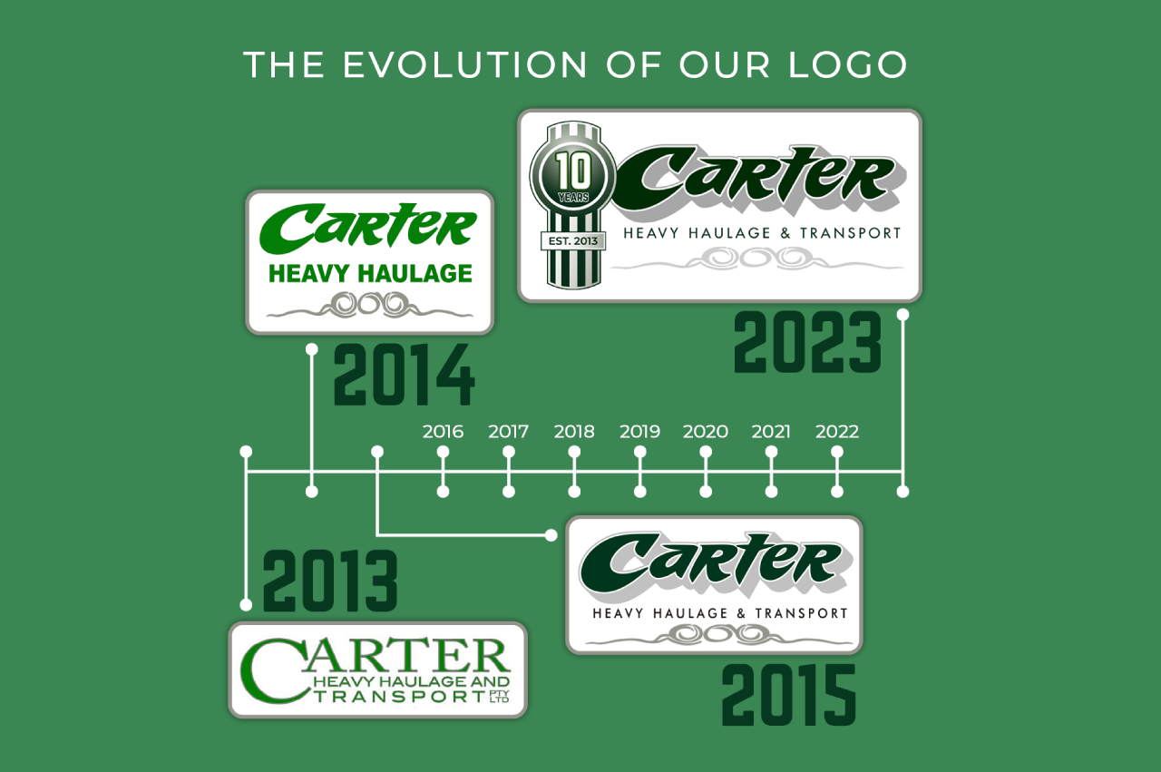
We developed the first logo through a rapid need for recognition. The challenge with logos is refining them, and then using them correctly. A great idea is worth nothing if you can’t articulate it, get it to market, or in this case, get it in front of the broader community and potential business partners. After designing the initial logo, I replaced my graphic designer hat with that of a marketer.
As Carter Heavy Haulage progressed, we employed the skills of Danny Showman, known throughout the trucking industry for his remarkable work in creating masterpieces on big rigs. Danny used his airbrushing skills to turn Carter trucks into showstoppers. He then extended his skill set to graphic design and produced the second iteration of Carter’s logo.
In 2015, Danny extended his and the Carter repertoire and put a modern twist on the logo.
In 2023, celebrating the company’s 10th anniversary, we engaged LIVMEDIA and the extraordinary skills of Kirrily Dures. My brief to Kirrily. “Create a showstopper logo to incorporate our brand, Kenworth, and 10 years in business.” Kirrily understands the inspiration-perspiration ratio and “knocked it out of the park”.
I am well aware of the “perspiration” quotient. The first year in 2013 was about finding our feet, which was interesting. I had general business knowledge, but I never thought I’d end up designing a logo. The history of our logo is an important part of our story. It says something about our progress that we now engage LIVMEDIA for marketing.
Carter’s vision has always been teamwork and inclusivity. Josh and I are always keen to reflect on the “Carter crew” and pay respect to our team of employees for their loyalty, dedication, and passion.
Our annual growth rate has forced us to continually navigate the competitive local landscape as carefully as possible. Our strategy is based around our ability to be flexible and diverse with our staff. We have a big focus to build and cement solid relationships with our team, business partners, and families.
Carter Heavy Haulage & Transport has always maintained good business practices and a focus on safety. Our original business plan has evolved over the years, but the roots are still strong. We aim to provide safe, professional, cost-effective heavy haulage transport, regionally, state-wide, and across Australia while maintaining true values to a family-owned and operated business.
The story of Carter’s logo runs parallel with the growth of our business. It has always been in safe hands. As Josh says, “that’s just the way we roll”.


